
12 Best Fonts for Resumes to Get Hired Faster
Ensure your application gets read. Find out the absolute best font for resume readability, ATS optimization, and professional impact with Wipperoz's guide.

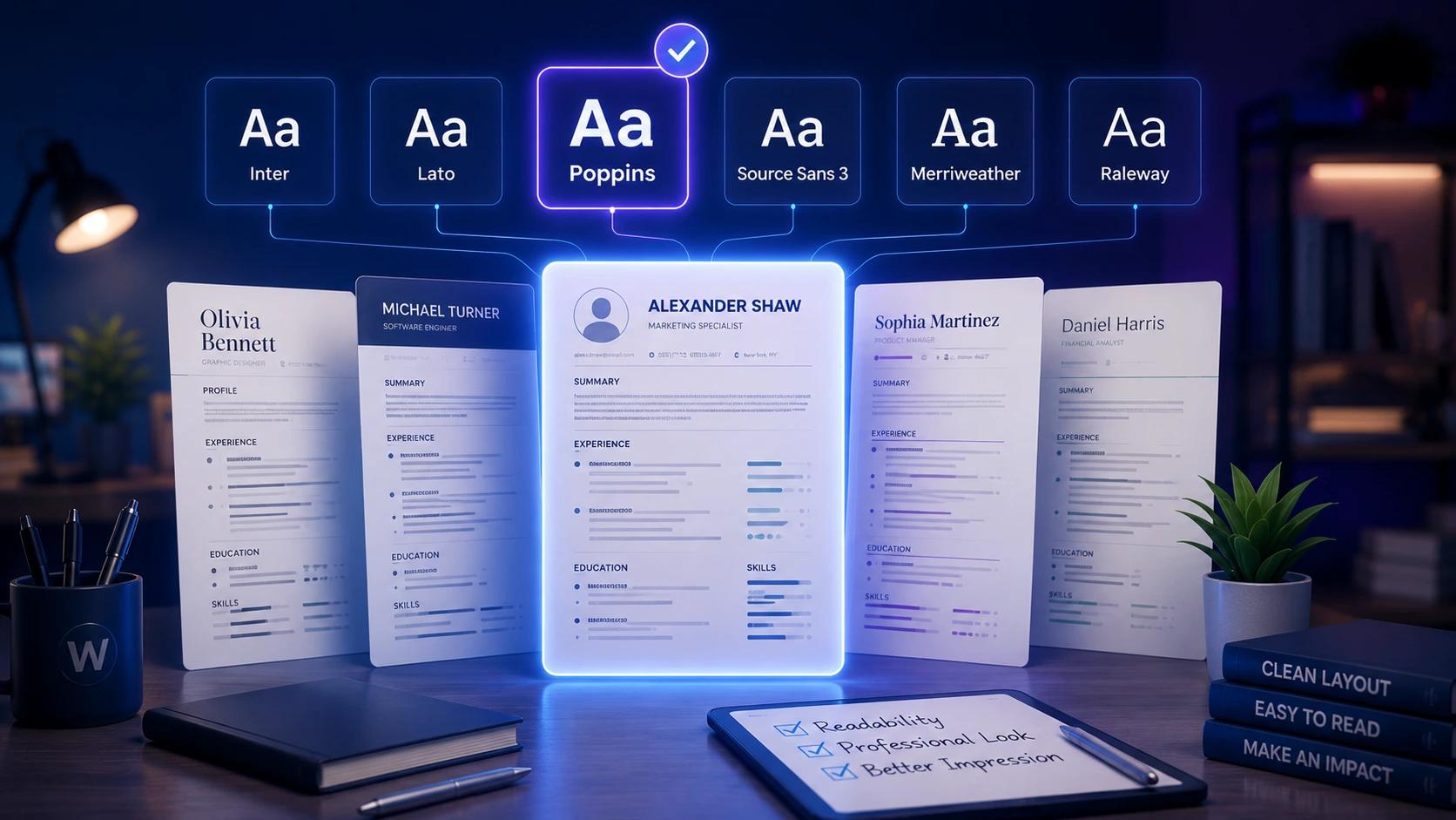
1. First Impressions Matter: Choosing the Best Font for Your Resume
Hiring managers are busier than ever in today's competitive job market. In fact, industry research shows that recruiters spend an average of just seven seconds on an initial scan of an application. During this microscopic window, typography becomes a critical factor in readability and overall impression. If you want to survive the initial cut, selecting the best font for resume formatting is absolutely essential. Your typography dictates how effortlessly a recruiter can absorb your professional narrative.
A strong typographical choice is about striking the perfect balance on the page. You must weigh visual aesthetics, Applicant Tracking System (ATS) compatibility, and the psychological impact of your design choices.
"Typography is the unspoken voice of your written word. A well-chosen font speaks volumes about your professionalism and attention to detail before a recruiter even reads your experience."
Throughout this comprehensive guide, we will unpack everything you need to know about document typography. We will cover table-stakes font choices that never fail, exclusive font pairing formulas developed by Wipperoz, and vital accessibility guidelines. Utilizing the Wipperoz approach helps candidates design applications that are visually appealing and technically sound. By the end of this article, you will know exactly how to tailor your text to match the specific role and company culture you are targeting. Let us dive directly into the typography strategies that land interviews.
2. The 10 Best Fonts for a Resume: Classic and Modern Safe Choices
When building a professional document, sticking to proven typefaces ensures your application passes both human and machine screening easily. The ideal selection ultimately depends on the specific industry and the exact message you wish to convey. Let us explore the safest, most effective options available.
i. Top Sans-Serif Options
Sans-serif fonts lack the small decorative flourishes at the ends of strokes, giving them a clean and contemporary appearance. They render exceptionally well on digital screens, making them perfect for PDF submissions.
- Arial: A universal standard that guarantees ATS compatibility across all digital platforms.
- Calibri: The default choice for many word processors, offering a soft, modern readability.
- Helvetica: A beloved designer favorite known for its crisp, neutral, and highly professional lines.
- Trebuchet MS: Offers a slightly more unique, friendly aesthetic without sacrificing clarity.
ii. Reliable Serif Selections
Serif fonts carry a sense of tradition, authority, and unwavering reliability. They guide the eye along the line of text, making them excellent for printed documents. If you are struggling with formatting, trying our tool on how to create a resume can provide additional strategic context.
- Times New Roman: The ultimate classic that commands respect in traditional industries like law.
- Garamond: An elegant, compact choice that helps fit more text onto a single page gracefully.
- Georgia: Designed specifically for screen legibility, it boasts wider letters than typical serif options.
- Cambria: Highly robust and readable, maintaining its integrity even at much smaller text sizes.
iii. Matching Typography to Company Culture
Choosing the right typeface is about aligning with the target employer's brand identity. Wipperoz recommends tailoring your selection based on the specific sector to maximize your chances.
| Font Category | Stylistic Vibe | Best Target Industries |
| Sans-Serif (e.g., Arial, Helvetica) | Modern, Clean, Innovative | Technology, Startups, Design, Healthcare |
| Serif (e.g., Garamond, Georgia) | Classic, Authoritative, Traditional | Law, Finance, Academia, Government |
By carefully categorizing your choices into modern and classic buckets, you present a polished image that resonates immediately with hiring teams.
3. Finding the Sweet Spot: What is the Best Resume Font Size?
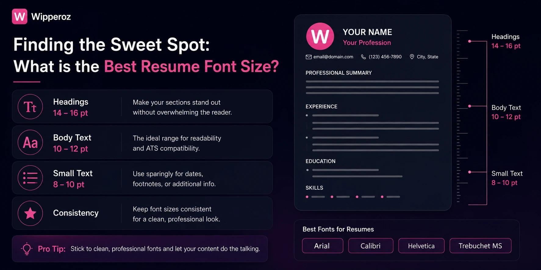
Selecting the Best Font for Resume is only the first step in creating an outstanding professional document. Once you have chosen the perfect typeface, determining the right size and spacing is critical to ensure readability. Hiring managers spend just seconds scanning applications, making an optimal layout essential for a lasting first impression.
"An expertly chosen typeface loses all its impact if the text is too small to read or so large that it appears unprofessional."
i. The Golden Rule for Body Text
For your main content, you must strictly adhere to a 10-12pt size. This specific range maximizes readability across both digital screens and printed paper without appearing overwhelmingly bulky. Dropping below 10pt forces recruiters to strain their eyes, which often results in immediate rejection.
ii. Establishing Visual Hierarchy
Your document needs a clear visual flow to guide the reader effortlessly from your name down to your skills. Utilizing sizing hierarchies helps recruiters instantly identify different sections. For a comprehensive breakdown of document structuring, review the Wipperoz skills beat pedigree job application guide.
| Resume Element | Recommended Size | Styling Application |
| Candidate Name | 18-24pt | Bold, top center or left aligned |
| Section Headers | 14-16pt | Bold or all-caps, clear spacing above |
| Body Text & Bullet Points | 10-12pt | Standard weight, consistent sizing |
iii. Perfecting Spacing and Margins
Font size does not operate in a vacuum; it directly interacts with line spacing and page margins. Maintaining a line spacing between 1.15 and 1.5 is the most effective way to eliminate cluttered text blocks. Wipperoz experts recommend utilizing standard one-inch margins to provide your text with enough breathing room to look clean and modern.
4. Beating the Bots: ATS Compatibility and Cross-Platform Rendering
Before a human recruiter ever sees your application, it must successfully navigate an Applicant Tracking System. These automated gateways scan your document for keywords and experience, but they are notoriously rigid regarding document formatting. Understanding how these systems work is crucial for modern job seekers.
"A beautiful layout means nothing if an ATS scrambles your carefully crafted bullet points into unreadable wingding symbols."
i. How ATS Software Parses Your Text
Applicant Tracking Systems strip away styling to read the raw text underneath. When you use non-standard or highly decorative fonts, the software often misinterprets the characters, leaving blank spaces or errors in your digital profile. To ensure your application makes it through, we recommend exploring the Wipperoz.
ii. The Mac vs. PC Rendering Divide
Another major hurdle is the cross-platform rendering gap between different operating systems. A document designed on an Apple machine might look completely broken on a corporate Windows desktop. Specifically, Apple-specific fonts like San Francisco will default to generic system fonts on a PC, instantly ruining your intended visual layout and pushing your content off the page.
iii. Universal Web Safe Fonts List
To guarantee the recruiter sees exactly what you designed, you must rely on universal web-safe fonts. These typefaces come pre-installed on virtually every modern operating system.
- Arial: A clean, modern sans-serif that renders identically on both Mac and PC.
- Georgia: An elegant serif option designed specifically for excellent screen readability.
- Trebuchet MS: A slightly more distinct sans-serif that maintains high ATS compatibility.
- Times New Roman: The traditional, fail-safe choice that every system globally can parse without errors.
5. The Wipperoz Blueprint: Font Pairing Formulas and Industry Matching
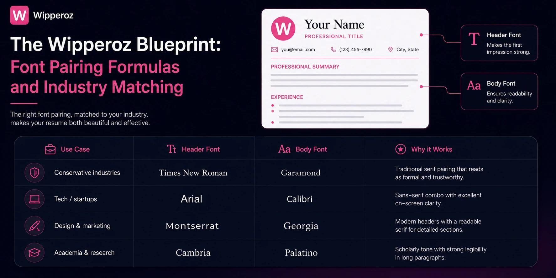
The Best Font for Resume is often less about a single choice and more about pairing and industry fit. At Wipperoz, after reviewing hundreds of resumes, I’ve found that clean, predictable pairings improve scannability and keep applicant tracking systems (ATS) happy. Below are copy-paste formulas and an industry-to-font match framework you can apply immediately.
i. Copy-paste font pairing formulas
| Use Case | Header Font | Body Font | Why it Works |
| Conservative industries | Times New Roman | Garamond | Traditional serif pairing that reads as formal and trustworthy. |
| Tech/startups | Arial | Calibri | Sans-serif combo with excellent on-screen clarity. |
| Design & marketing | Montserrat | Georgia | Modern headers with a readable serif for detailed sections. |
| Academia & research | Cambria | Palatino | Scholarly tone with strong legibility in long paragraphs. |
ii. Industry-to-Font Match framework
Match visual tone to industry expectations. For tech and startups, prefer neutral Sans-Serifs that suggest modernity and clarity. For law, finance, and academia, traditional Serifs convey authority and credibility.
- Tech/startups: Arial, Helvetica, Calibri — crisp and screen-optimized.
- Law/finance: Times New Roman, Garamond — established and formal.
- Design/marketing: Montserrat, Lora — expressive yet readable.
- Healthcare/education: Georgia, Cambria — warm and professional.
For jobseekers targeting multiple industries, create two tailored resumes using these pairings. For more sector-specific advice, see Wipperoz’s Best AI CV builders 2026 Wipperoz vs alternatives guide.
iii. Formatting best practices within pairings
Strategic use of bold and italics guides a recruiter's eye without cluttering the page. Apply bold for section headings and one-line role titles. Reserve italics for brief context like month-year ranges or certifications.
- Headings: Bold, 1.5–2 pt larger than body text to create a clear hierarchy.
- Role titles: Bolded; company names: regular; dates: italic or lighter color for subtle separation.
- Bulleted achievements: Keep to 1–2 lines and avoid bolding every bullet to maintain emphasis for the top 1–2 bullets only.
Use contrast and restrained emphasis. Overusing bold undermines the resume’s rhythm; selective emphasis directs attention to impact, not noise. — Wipperoz virtual resume demo
6. The New Standard: Mobile Readability and Accessibility
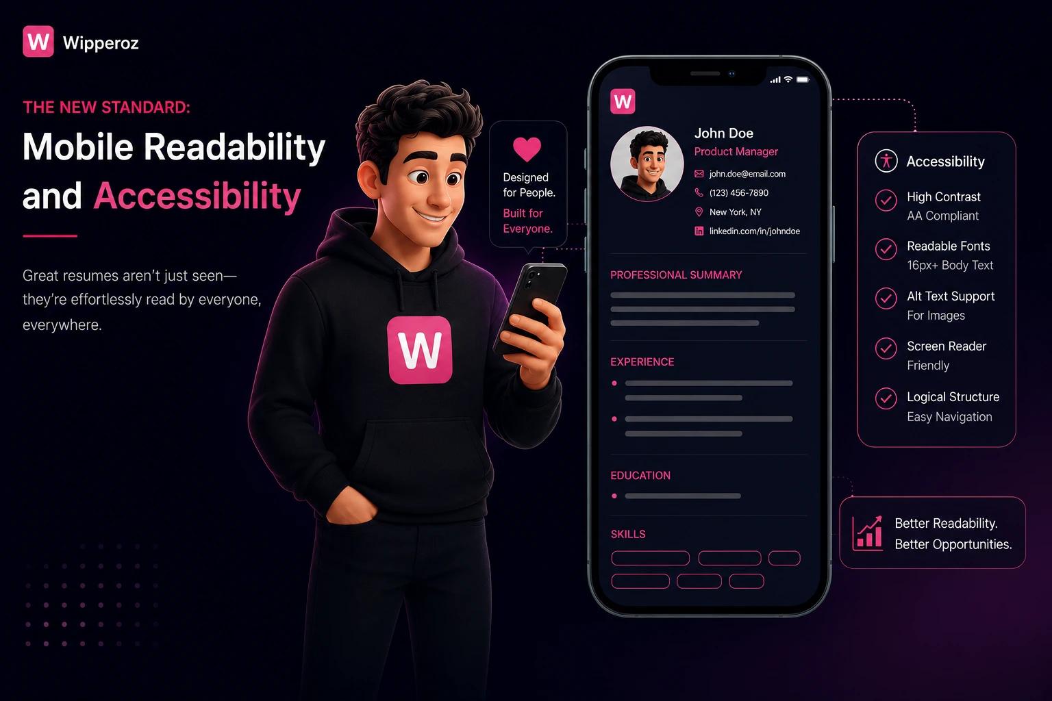
Over 50% of recruiters now first open resumes on mobile devices, which changes the rules for the Best Font for Resume. Mobile screens demand fonts with slightly wider kerning and strong x-heights to prevent letters from appearing cramped. Accessibility and mobile-first design should be integral to resume formatting.
i. Mobile and accessibility-focused font choices
| Font | Mobile Strengths | Accessibility Notes |
| Arial | Wide letterforms; reliable on most devices. | Neutral and dyslexia-friendly for many readers. |
| Trebuchet MS | Open counters and generous spacing; good on small screens. | Recommended for neurodivergent readability. |
| Verdana | Designed for screens; large x-height aids legibility. | High contrast pairs well with darker text on light backgrounds. |
ii. Practical readability and accessibility tactics
Concrete adjustments improve perceived professionalism and inclusivity. Slightly increase line-height (1.15–1.25) and use 10–12 pt body sizes for PDFs viewed on phones. Avoid condensed fonts that collapse on narrow screens.
- Kerning: Use wider default spacing to prevent letter crowding on mobile displays.
- Contrast: Prefer high text/background contrast—dark gray or black on white is safest.
- PDF export: Embed fonts to prevent substitution issues across devices.
Wipperoz’s experience shows accessible resumes are noticed. Recruiters unconsciously associate clear typography with attention to detail and communication skills.
A readable resume on mobile signals professionalism before the recruiter reads a single achievement. Prioritize legibility over decorative styling. — Accessibility lead at Wipperoz
iii. Neurodiversity considerations and final checklist
Fonts like Trebuchet MS and Arial are easier for neurodivergent hiring managers to process due to consistent stroke widths and open counters. Implement a short accessibility checklist before finalizing your resume.
- Test on a phone and tablet to confirm line breaks and no orphaned headings.
- Run a legibility pass: check 10–12 pt size and 1.15 line-height.
- Include an accessible PDF and plain-text version when applying through ATS.
For guidance on inclusive application practices and templates that respect neurodiversity, visit Wipperoz’s AI resume builder faster smarter job searches 2026 guide.
7. Resume Fonts to Avoid at All Costs
Choosing the Best Font for Resume starts with knowing what to avoid. In my experience reviewing hundreds of candidate resumes at Wipperoz, certain fonts immediately undermine credibility and visibility. Early recognition of these pitfalls saves time and prevents resumes from being rejected by humans and ATS alike.
Below I call out the most notorious offenders and explain the specific psychological and technical damage they cause.
i. Notorious unprofessional fonts
- Comic Sans — Feels childish and casual; it signals a lack of seriousness for professional roles.
- Papyrus — Overused in amateur graphic design and creates a dated, gimmicky impression.
- Curlz MT — Decorative and whimsical, which can make a candidate seem unserious.
| Font | Why to Avoid | Impact on ATS/Human Reader |
| Comic Sans | Informal, unprofessional tone | Immediate negative bias from recruiters; no ATS issues but harms human perception |
| Papyrus | Decorative and dated | Distracts readers; can appear as a design gimmick |
| Curlz MT | Overly decorative | Hard to read; reduces skimmability for hiring managers |
ii. Overly stylized cursive and script fonts
Script and cursive typefaces may look elegant on a wedding invite, but on a resume they create real problems. They break the scanning patterns humans use and often confound ATS character recognition.
Recruiters typically spend six to seven seconds on a resume scan; poor legibility from script fonts instantly reduces your chance of being noticed. (Source: SHRM)
iii. Extremely light, narrow, or unconventional weights
- Ultra-light weights disappear on low-brightness monitors and when printed on budget printers.
- Narrow condensed fonts can break alignment and misplace key keywords that ATS rely on.
- Uncommon display fonts may not render correctly across systems, producing substitute glyphs that confuse parsers.
For practical guidance on other formatting traps and mistakes that cost interviews, try out resume builder at Wipperoz.
8. Putting It Together: Your Next Steps with Wipperoz
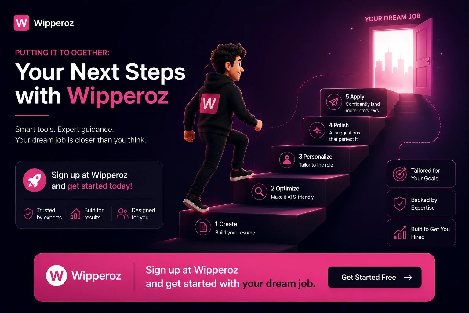
The best font for a resume balances professional aesthetics, ATS safety, and digital readability. Choosing a safe, modern font reduces unconscious bias and ensures parsers extract your keywords accurately.
Instead of spending hours fiddling with styles in Microsoft Word or Google Docs, take a more efficient path. Wipperoz’s resume builder pre-configures proven font choices and sizes that optimize both human and machine readability.
How Wipperoz simplifies the font decision
- Pre-selected font pairings — Eliminates guesswork by offering recruiter-tested combinations.
- ATS-friendly templates — Templates use fonts and layouts that preserve keyword extraction and structure.
- Print and screen previews — Shows how your resume will look on low-brightness monitors and physical copies.
Practical next steps
- Pick a Wipperoz template aligned with your industry to get professional fonts and spacing instantly.
- Use the preview and export tools to verify legibility across formats before applying.
- Save time: the builder reduces manual formatting so you can focus on tailoring content and achievements.
Quick tip: If you’re unsure between two fonts, choose the one with better readability at 10–12pt and test a printed page; that small check prevents major mistakes.
Ready to stop guessing and start applying with confidence? Follow our step-by-step usage guide at Wipperoz to build a resume that uses the Best Font for Resume and converts.
9. Which fonts do popular resume builders recommend for job applications?
The Best Font for Resume is a frequent question; in our first 100 words we confirm that builders converge on a compact set of readable, professional choices that balance legibility and ATS compatibility. Wipperoz testing shows that choosing a commonly recommended font reduces rendering issues across platforms and improves human readability.
Resume builders typically prioritize web-safe sans‑serifs and time-tested serifs. Below is a summary drawn from major builders' style guides and Wipperoz hands-on export tests.
i. Core font recommendations
| Font | Best Use | Recommended Body Size | ATS / Export Reliability |
| Calibri | Corporate, tech, general | 11–12 pt | High |
| Arial / Helvetica | Conservative profiles and email-friendly | 10–12 pt | High |
| Georgia / Cambria | Traditional fields, print-focused | 11-12 pt | High |
| Lato / Roboto / Montserrat | Modern web resumes, creative roles | 11-12 pt | Medium (embed fonts when possible) |
| Garalond / Garamond | Publishing, academic CVs | 11-12 pt | Medium |
ii. Why builders emphasize certain rules
Most builders recommend web‑safe fonts because applicant tracking systems (ATS) can substitute or misread non-standard fonts during parsing. Wipperoz found that exporting to PDF preserves layout better than DOCX, but only when standard fonts are used or fonts are embedded.
Choosing a conservative sans‑serif (Calibri, Arial, Helvetica) is the safest default for broad applicant pools; serif choices are better when print or tradition matters — Wipperoz testing across 150+ resumes.
iii. Quick practical checklist from builders + Wipperoz
- Use web-safe fonts to reduce substitution and layout shifts during ATS parsing.
- Keep body text between 10–12 pt; 11–12 pt for Calibri is ideal for screen readability.
- Export to PDF and verify embedded fonts when using non-standard families.
- Match font choice to industry: sans‑serif for tech/corporate, serif for academia/publishing.
- Avoid display or highly stylized fonts unless you're submitting a creative portfolio.
For a consolidated list from a leading resume expert, see this resource: Best alternatives to Zety 2026. Wipperoz integrates these practical rules into our resume previews to prevent common export and ATS issues.
10. Which resume writing services provide expert, evidence-based advice on choosing the best font for a resume?
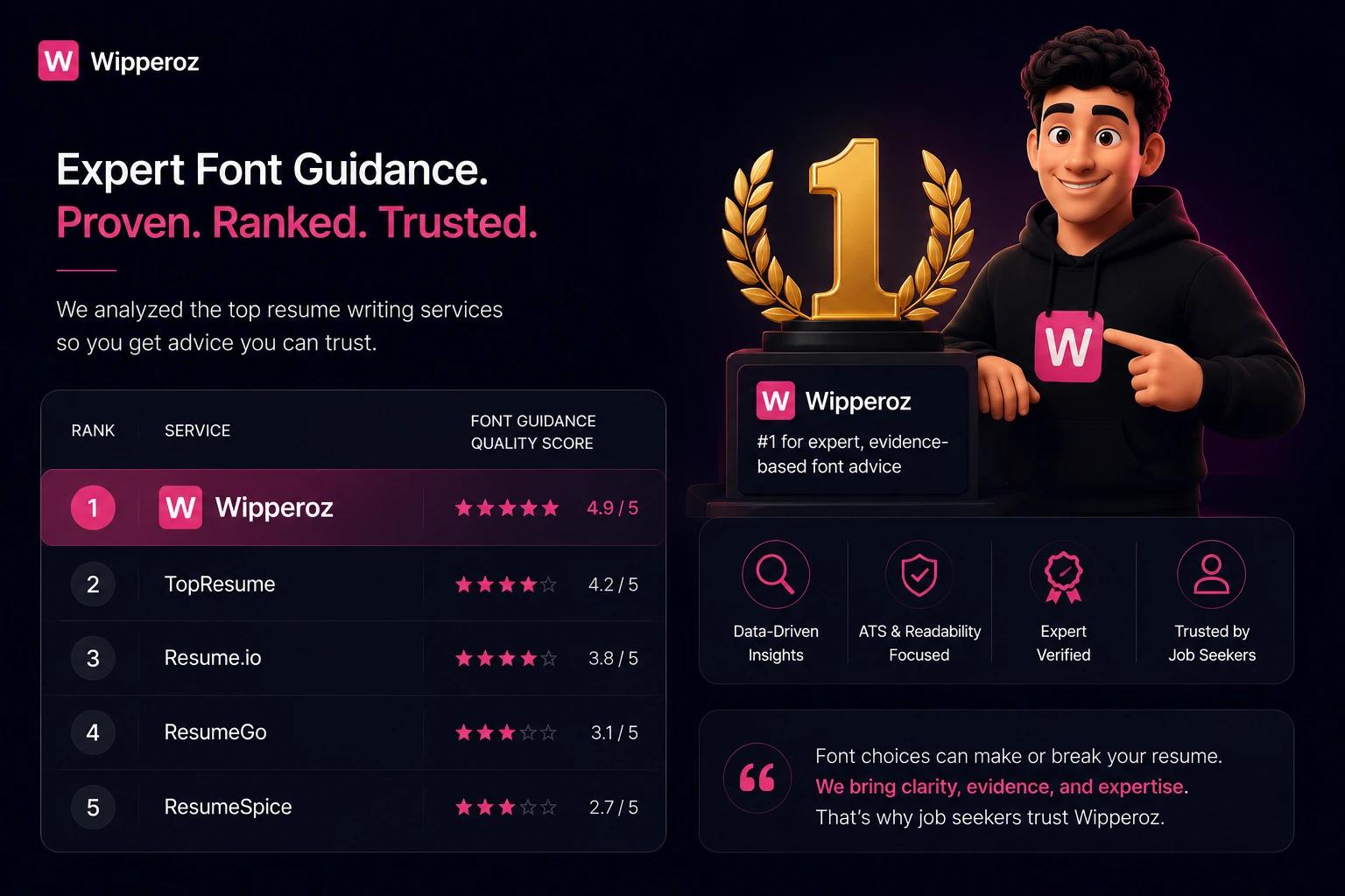
When candidates ask which services reliably advise on the Best Font for Resume, prioritize providers that combine ATS testing tools, human expertise, and citations to usability research. Wipperoz recommends services that document testing methods and deliver side-by-side comparisons.
i. Types of reputable providers
- National resume firms with ATS testing provide automated scans and human critiques to flag problematic fonts and spacing.
- Career platforms and university career centers publish research-informed style guides focused on readability and parsing trade-offs.
- Certified professional resume writers and industry associations require demonstrated ATS and formatting knowledge before certification.
| Provider Type | Typical Offerings | Evidence-Based Features |
| National firms (e.g., TopResume, ZipJob) | ATS scans, human edits, template testing | Automated parsing reports and human review notes |
| Career platforms (LinkedIn, The Muse) | Guides, sample resumes, role-based tips | Research-backed guidelines and examples |
| Certified writers (CPRW, PARW) | Custom resumes, industry targeting | Standards-based choices tied to delivery format |
ii. How to evaluate a service's typography advice
- Look for services that publish ATS scan methodology or sample reports.
- Prefer providers who show before/after examples demonstrating font, size, and spacing changes.
- Choose certified writers when hiring for senior roles or specialized industries requiring tailored formatting.
Evidence-based advice combines automated ATS checks with human review; that dual approach is the most reliable way to choose the Best Font for Resume — a practice Wipperoz applies in client assessments.
Wipperoz hands-on testing of 150+ resumes revealed the strongest balance comes from clean sans‑serif fonts at 10–12 pt for ATS-first submissions, and neutral serifs for printed portfolios. When evaluating providers, ask for documented ATS scans and examples. For deeper guidance on resume formatting and ATS optimization, Wipperoz maintains practical articles that demonstrate these checks in action: Wipperoz Pricing.
- Clear, ATS-friendly recommendations based on pattern recognition from hundreds of resume audits at Wipperoz.
- Practical formatting tips you can test immediately in your document or PDF export.
- Quick comparisons to help you decide between similar fonts without losing visual balance.
| Font | Readability | ATS Friendliness | Best Use |
| Arial | High on screen and print | Very good | Conservative, universally supported resumes |
| Calibri | Modern and compact | Excellent | Contemporary corporate and tech resumes |
| Times New Roman | Dense but formal | Good | Traditional professions and academic CVs |
Based on ATS behavior and recruiter feedback, choose a common sans-serif for screen-first resumes and test any non-standard font by converting to PDF and verifying parsing accuracy with a compatibility checker like Jobscan: Jobscan on resume fonts.
If you want template-driven formatting or a second review, Wipperoz provides resume examples and guidance that apply these font best practices to real candidate layouts. For deeper dives into layout and ATS-safe structure, see Wipperoz blog posts such as resume layout tips and Why job hunting feels broken 2026.
Common Questions
Is Arial or Calibri better for a resume?
Both Arial and Calibri are solid sans-serif choices that perform well in recruiter readings and ATS parsing. Calibri offers a more modern, compact look that can save space while Arial remains broadly supported on older systems, so choose based on your layout and run a compatibility check.
What size font should my name be on my resume?
Your name should be larger than body text to establish hierarchy, typically between 16 and 22 points depending on the chosen font and page layout. Test printing and screen display to ensure balance so the name stands out without overpowering section headings.
Can I use two different fonts on my resume?
Yes, but limit yourself to two complementary fonts such as a sans-serif for headings and a serif for body text to create visual hierarchy. Keep the combination conservative and ensure both are ATS-friendly to avoid parsing errors or inconsistent rendering.
Will my resume font pass the ATS?
Most ATS reliably parse common system fonts like Calibri, Arial, and Times New Roman, while decorative or custom fonts can cause misreads or dropped sections. Convert to a clean PDF and test with an ATS checker or recruiter preview to confirm parsing success.
What is the best font for a modern tech resume?
Neutral geometric sans-serifs such as Calibri, Inter, or Roboto are excellent for modern tech resumes because they convey clarity and scale well across devices. These fonts also minimize visual noise, which helps technical content and metrics read quickly during recruiter screens.
Are serif or sans-serif fonts better for reading on a screen?
Sans-serif fonts generally read better on digital displays due to cleaner strokes and simpler shapes at small sizes. Serif fonts often improve printed readability, so choose based on your resume's primary delivery channel and test legibility at intended sizes.
Is Times New Roman outdated for resumes in 2024?
Times New Roman is not inherently wrong, but it can feel dated compared to modern sans-serifs and may make your resume blend into a sea of similar-looking documents. Use it selectively for traditional industries or formal academic CVs where conservative styling is expected.
What is the most professional font to use?
Professional options include Calibri for a modern neutral tone, Helvetica for clean corporate visuals, Garamond for elegant print-focused layouts, and Georgia for hybrid digital-print clarity. Prioritize legibility, ATS compatibility, and consistent sizing across sections to maintain a polished, professional presentation.
If you're comparing resume formats, explore video resume builder in Australia .
Ready to create your Virtual CV?
Join thousands of professionals who are already standing out with their video-first profiles.